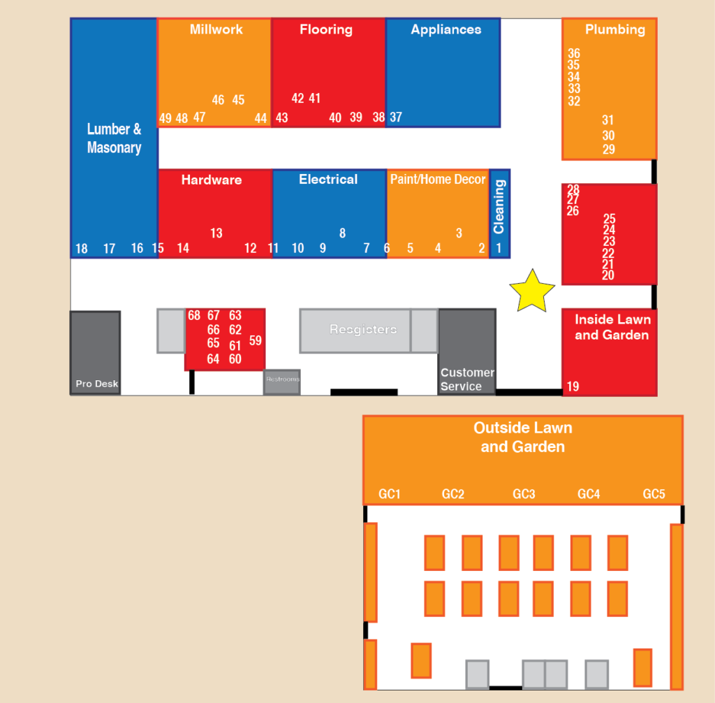

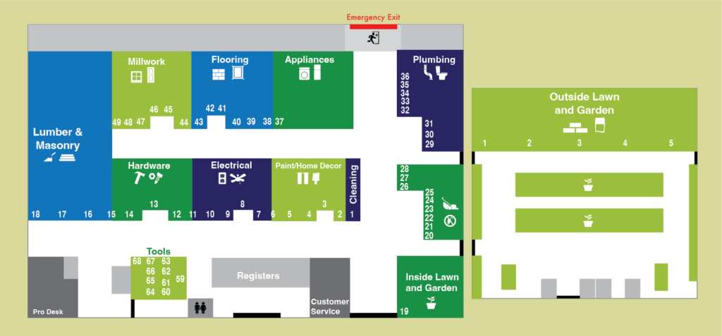
Hardware Map
Project Statement
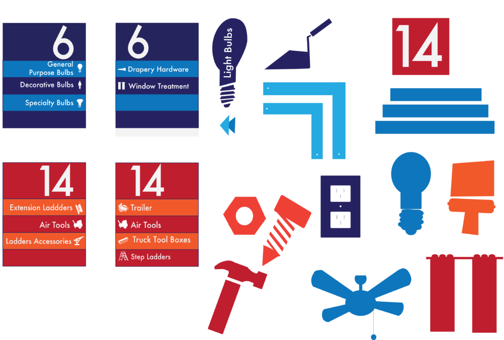
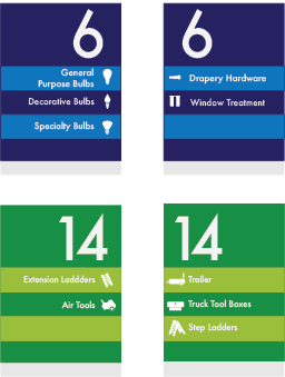
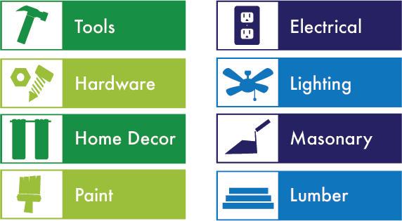
This way finding is for a fictional hardware store. The departments are divided up but varying blues and greens to make the separation between each aisle. In my research, it was found that some hardware stores have the same color over and over again through every sign. This causes the signs to blend together in the customer’s mind and confuse them. Along with the in-store map layout, there is hanging signs above each department and signs on every aisle with the designated color. The color palette of blues and greens allows the customers to feel calm and at ease when trying to locate their items. The font of Futura is a simple sans-serif font that is easy to read. Futura is a font that is not too heavy that it would hard to read or not too light that the viewer would not be able to see it.

Previous Versions