MechTech
Project Statement
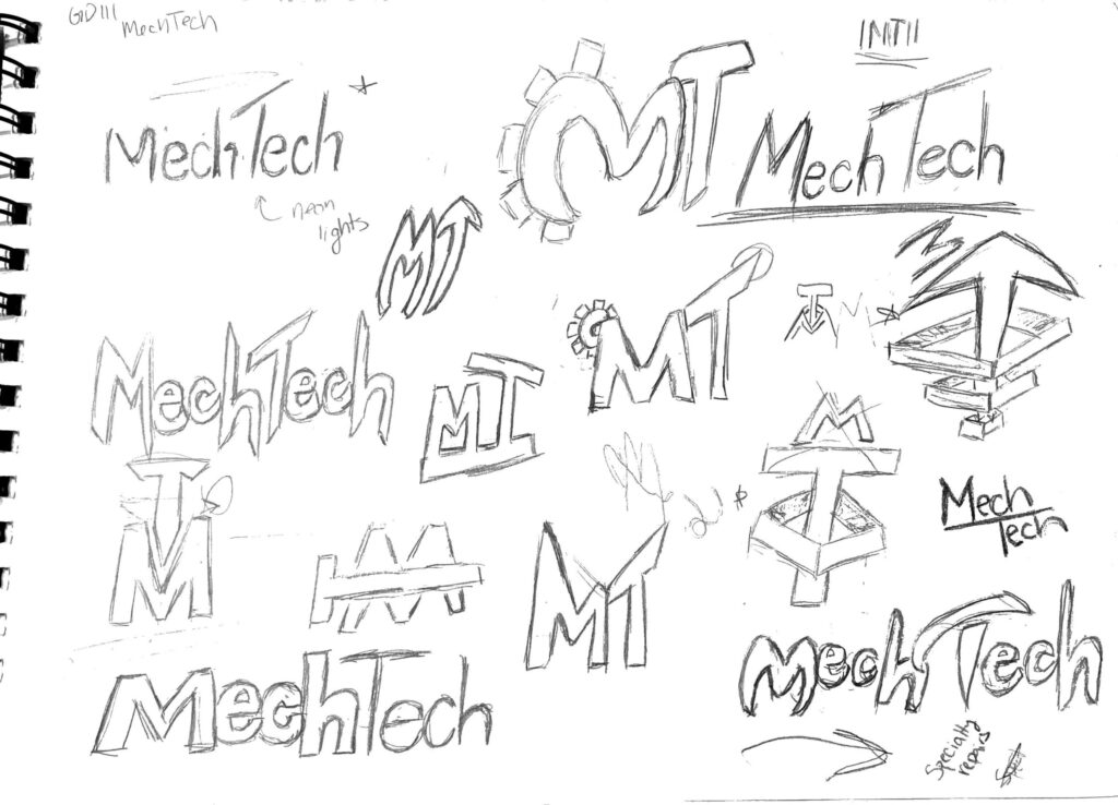
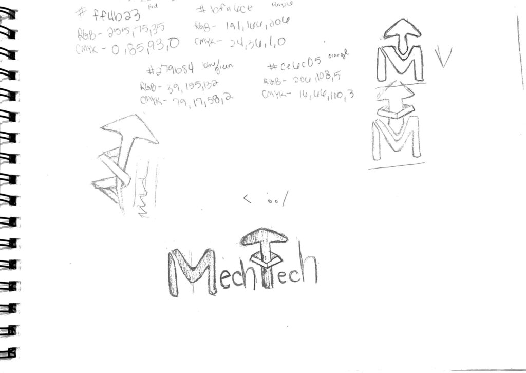
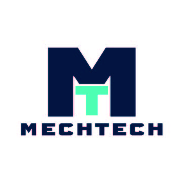
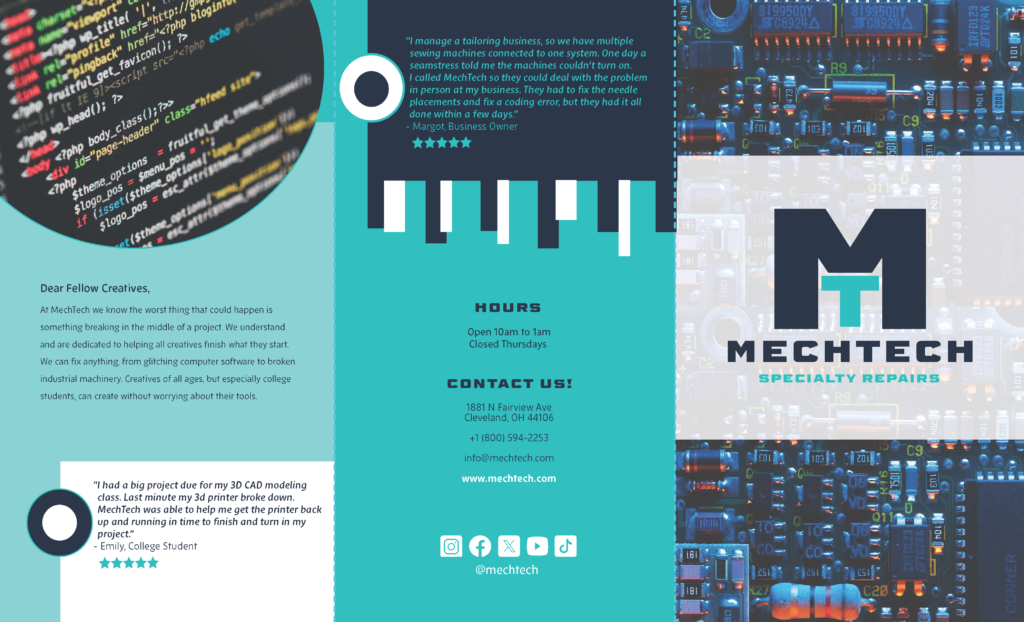
MechTech is a fictional specialty tech repair company that is founded by two sisters, one with experience in the tech industry and the other with a mechanical background. The logo consists of a “M” for mech with a “T” in the middle that stands for tech, in the font Barber (Fill). The bright teal against the dark navy blue creates a stark contrast that draws in the viewer’s eyes.
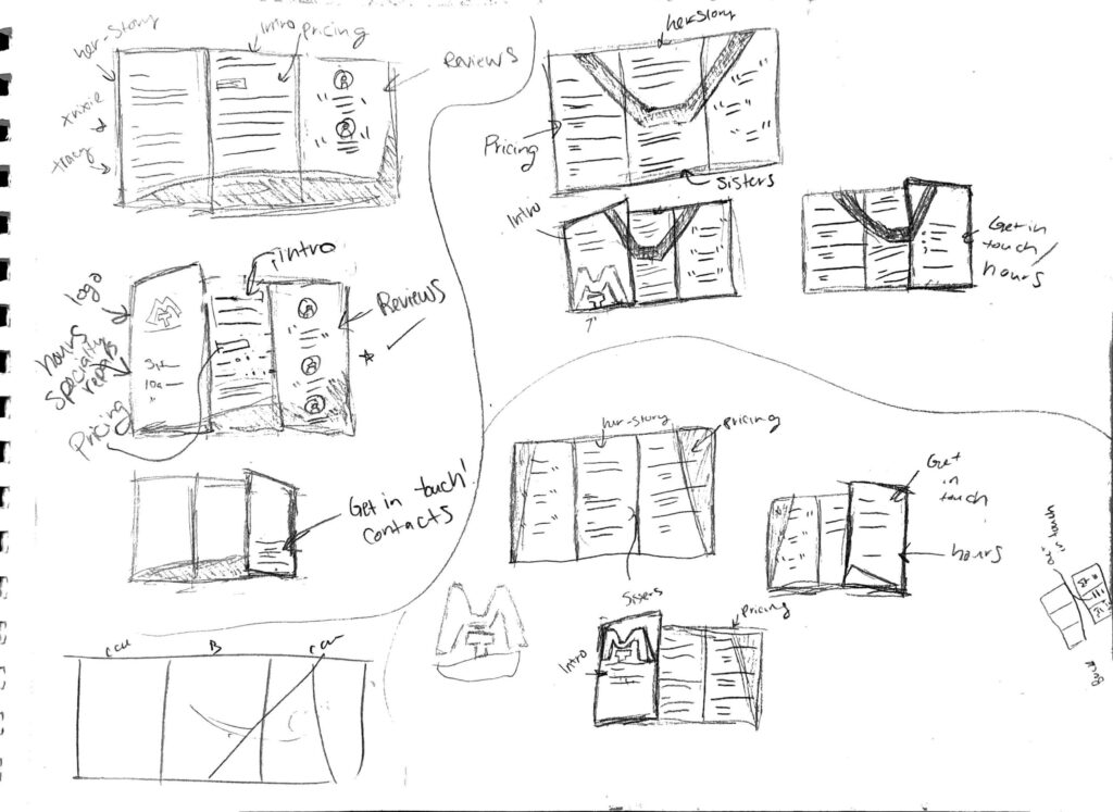
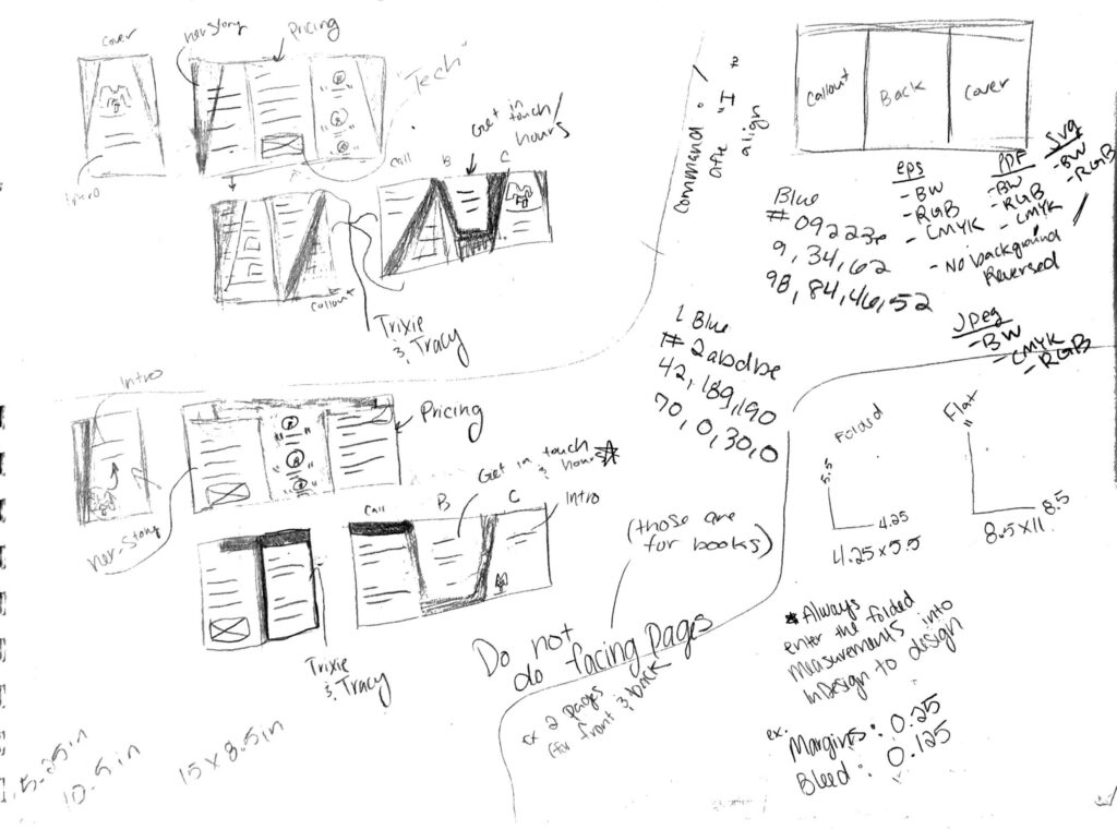
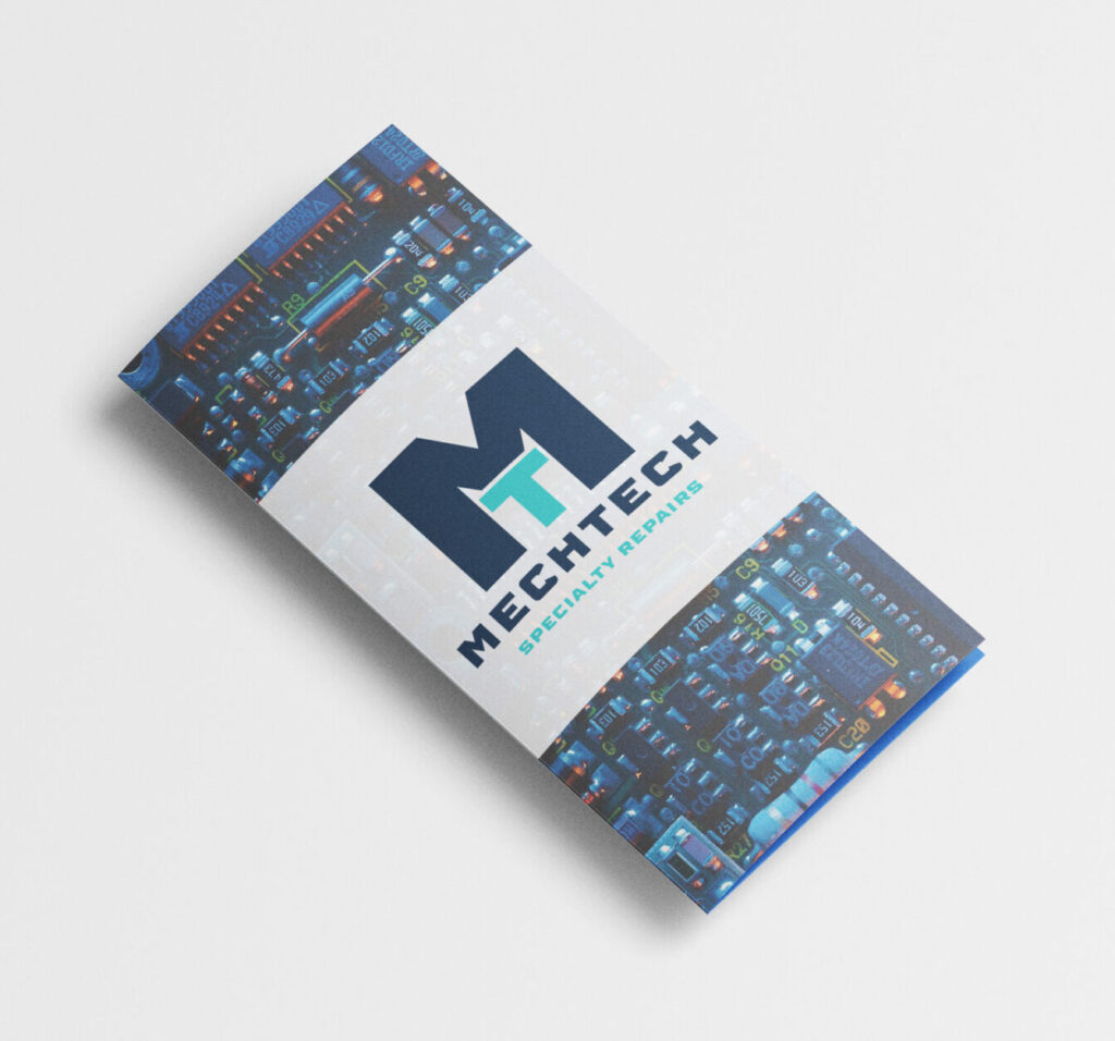
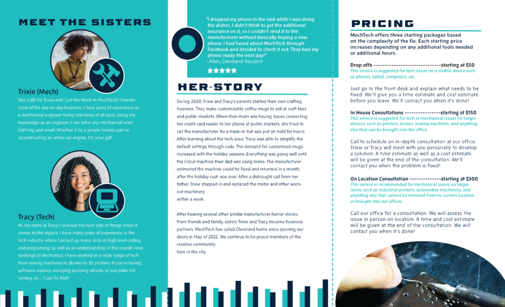
In the brochure, it goes over the history of the company, words from the sisters, hours, contact, and pricing for their services. The barber font and new zen font were used because they offer varying weight. Barber font shows a techy feel in the straight edges of the letters and the same height of letters throughout. New Zen contrasts barber with a lighter feel. The color palette is contrasting blues, a darker blue and allows for information to be seen against it. The color blue itself was used as it gives the viewer a cool and calm feel.
Outside of Brochure
Inside of Brochure
Previous Version
Sketches