Summary
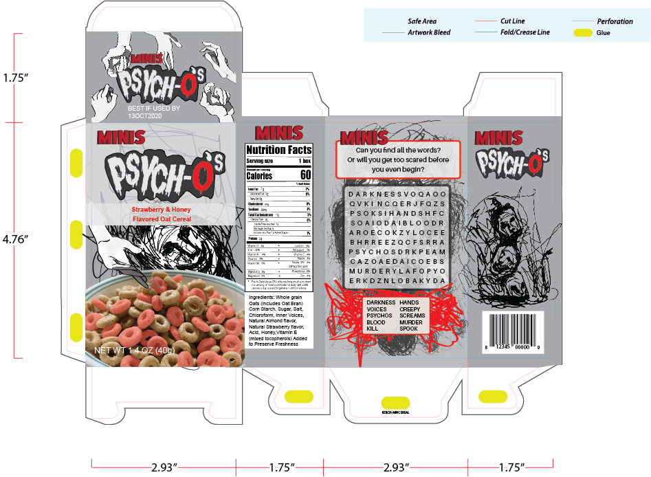
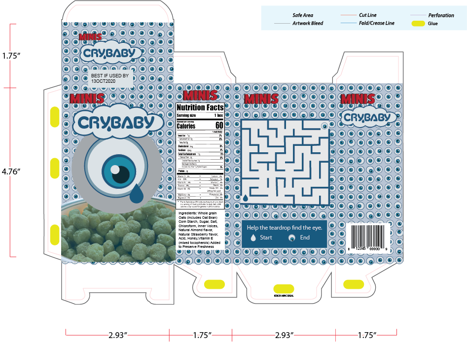
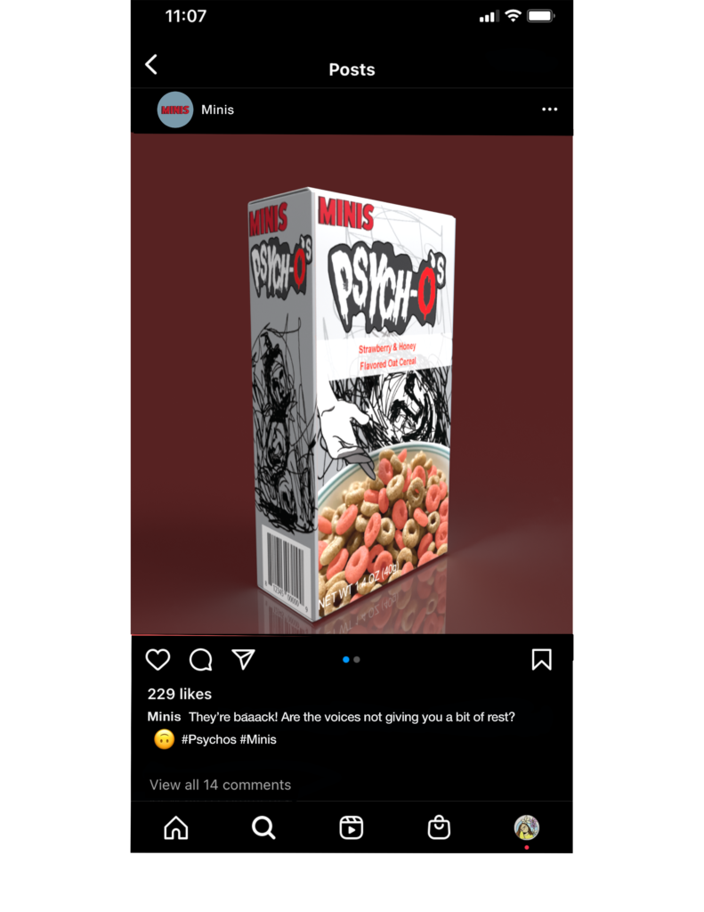
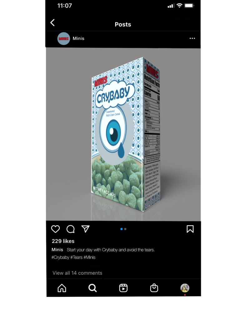
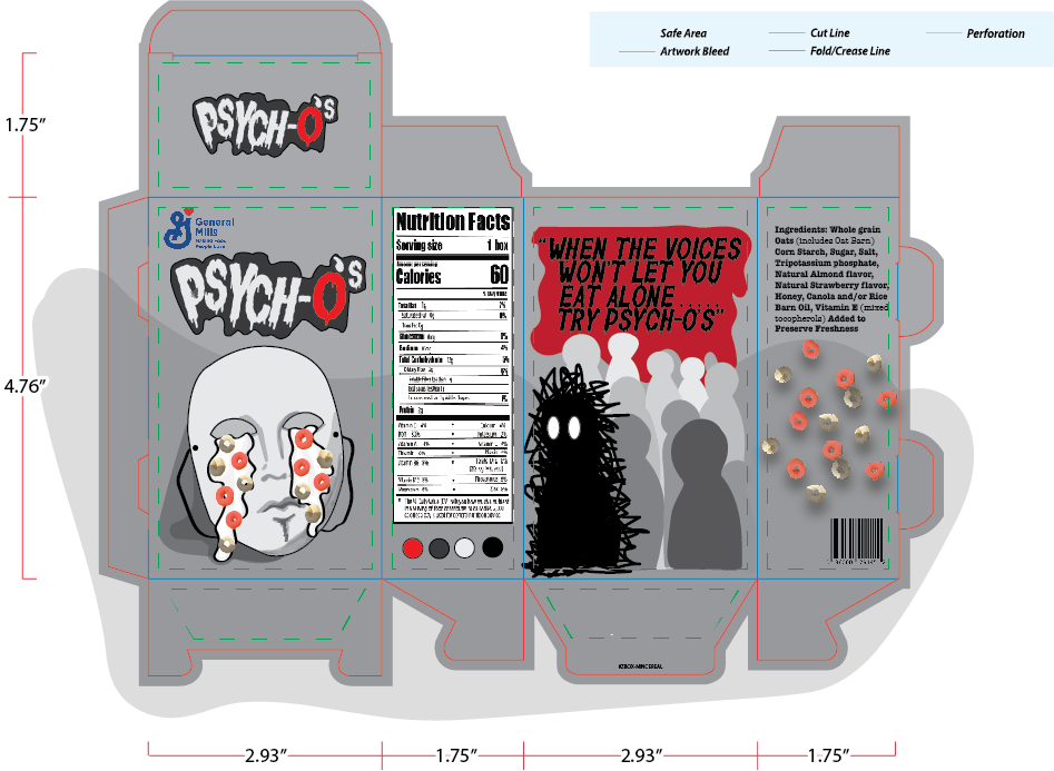
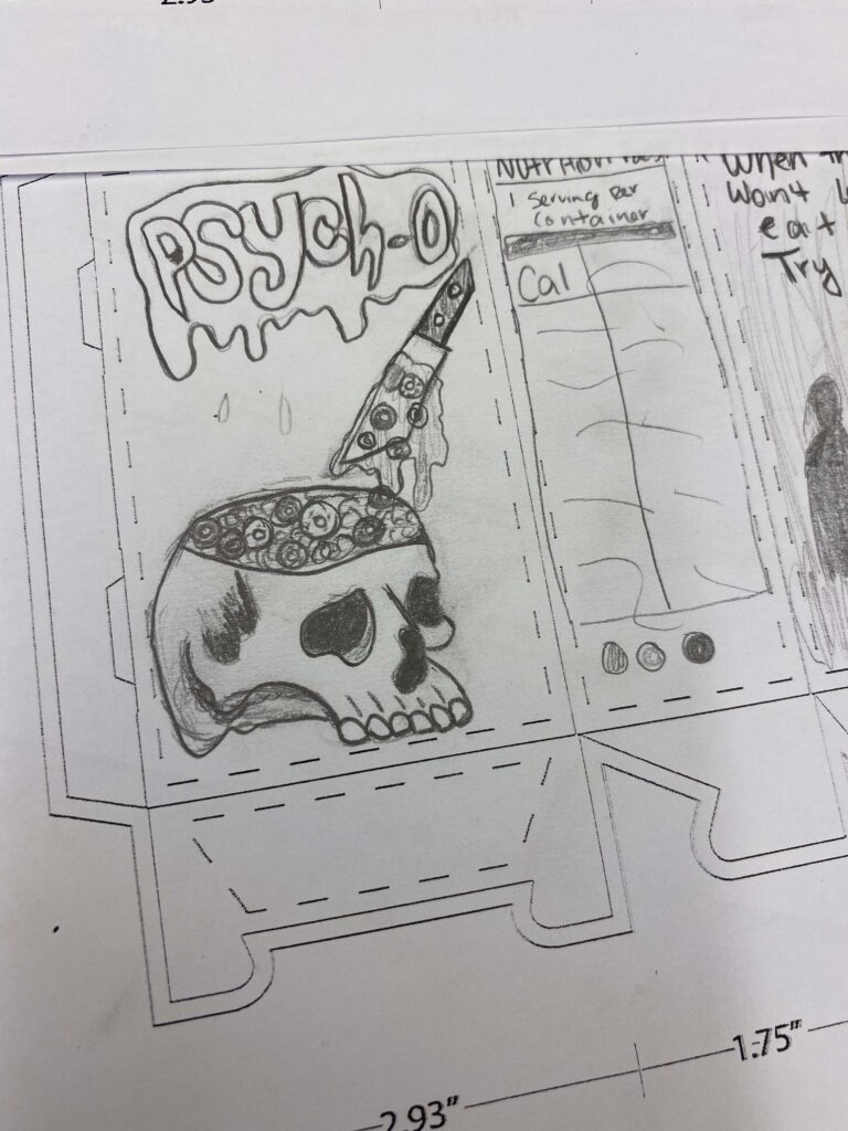
Minis cereal is a fictional cereal company. In this series, it features two different kinds of cereal, Psychos and Crybaby. In both cereals, the target audience is pre-teens or middle schoolers. There are two instagram posts made for the brand that promote the new cereals.
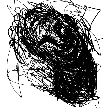
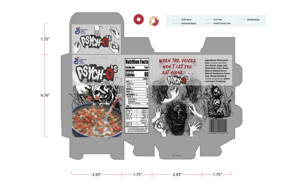
In the Psychos cereal, scattered throughout the box are reaching hands ans faces. The back of the box showcases a horror themed word search. The logo for Psychos is written in Horror Corps Demo that gives a halloween feel. The color palette features reds, black and greys that give the feel of horror. In the Crybaby cereal, it showcases eyes watching the viewer throughout the box. The back of the box features a maze for the viewer to “help the teardrop find the eye. The font for Crybaby is Silicone. The colors on the cereal box are blues that displays the feeling of sorrow and sadness.


Previous Version
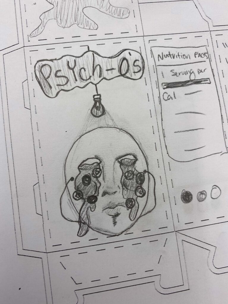
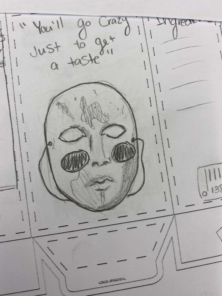
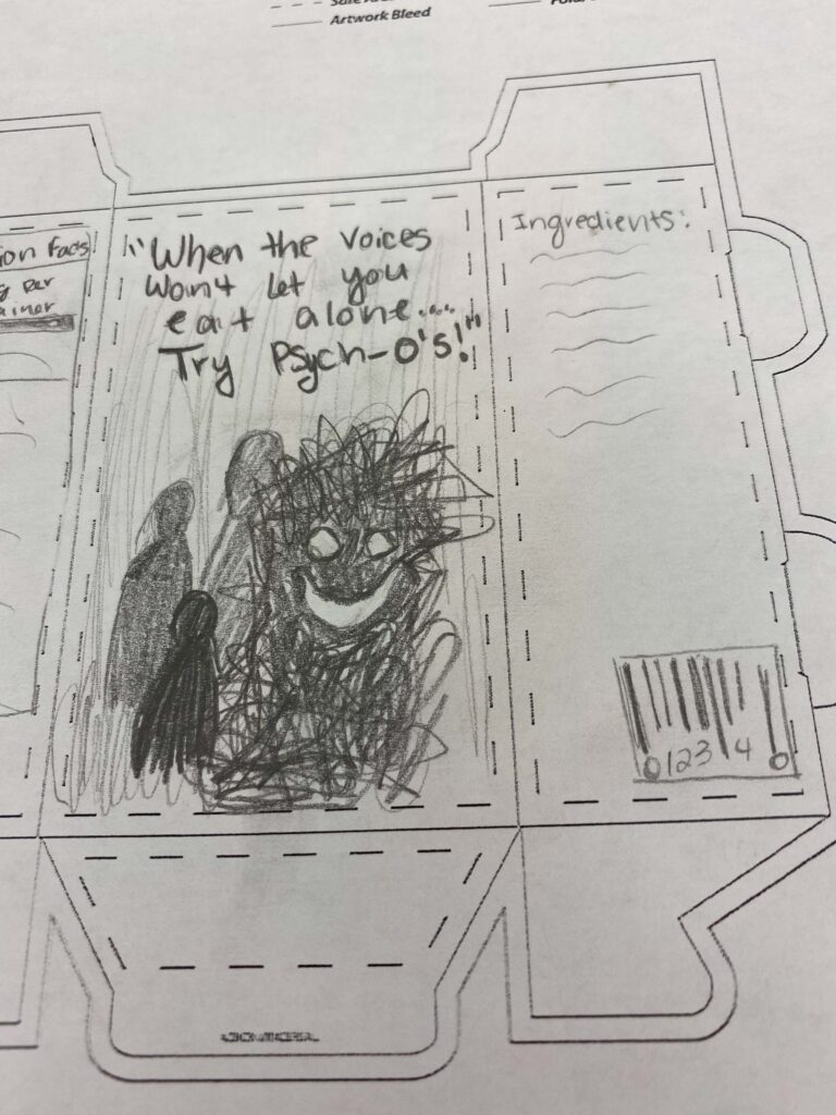
Sketches
Send me a Message
Other Ways to Contact Me:
Email: [email protected]

About Me
I am an entry level graphic designer with experience in logos & branding, website design, print media, photography, illustration, and apparel design.
Art is something that I am continuously learning and pushing myself to excel in. Through art, I have been able to connect with others and meet a lot of interesting people. I have been around artworks and supplies all my life with my mom being an art therapist. The concept of surrealism has always interested me as an artist. I find that it allows the artist to twist reality in a creative way. Surrealism allows the artist to tell a story within the piece. The creativity and ideas behind art always draw me in. In my own personal artwork, I like to include elements of surrealism and create a story behind the works.


